Showing posts with label typography. Show all posts

Wednesday, November 10, 2010

First Big Conference

Last month I had the privilege to attend the American Printing History Association meeting, hosted by the Chesapeake chapter, held at the Corcoron College of Art + Design in Washington D.C. My professor was one of the main speakers and what better opportunity to attend my first conference.

Before the conference started the participants were offered a variety of tours to places like the the Library of Congress Rare Book room, the Government Printing Office, and the National Museum of American History. I chose the NMAH. First we traveled to the bowels of the building to visit the print shop. Due to possible lead contamination from the type, we all had to wear little hospital booties so we wouldn't track the lead through the rest of the museum. Inside there were a number of presses including a Chandler & Price clamshell platen press, a Vandercook SP25 Power flatbed press, three Civil War era  proof presses that were used on the battlefields, and a couple other presses I've never seen or heard of before and sadly don't remember the names. Then we moved onto the print collection room on a different floor of the museum where I got to see and touch an original Kelmscott Press Edition of Chaucer's Canterbury Tales!! I was so transfixed, I took about a million pictures of it, but of course nothing can compare to seeing the real thing. After the print room we went to the Dibner Library to look at collections of rare books including an original Galileo printed text about the moon, and a medieval medical text depicting "Wound Man," an illustration of a man who suffers all manner of wounds likely to inflict a medieval man.

After a short walk across the Mall, I enjoyed some refreshments and conversations at the Corcoron before listening to a beautiful talk by Boot Arts scholar Betty Bright. The New York Center for Book Arts had a panel discussing how they manage their facility. The Chesapeake chapter of the APHA had a panel discussing how they became printers, how they acquired equipment, and how they function as a group. Kathleen Walkup discussed the program she runs out of Mills College in Berkley, Ca. Lyll Harris, Kathleen's student, gave a wonderful presentation on one of the projects she has been working on involving using an medieval italian text as inspiration and model for a piece of her own. My professor, Steve Miller, spoke about his history in the Book Arts, how is work is driven by collaborations with authors and artists, and the people who have been most influential to him. His speech was so inspiring and encouraging for an up and comer as he illustrated how open and supportive communities are and the importance of establishing and maintaining them.

We also were able to go to the Corcoron's Georgetown campus and check out their printmaking facilities and listen to many more small sessions from how to use book arts to artfully represent scientific research to the logisctics of running your own shop, either independently or within an institution. It is amazing how inventive people can be in order to do what they love. We were so blessed to be able to have our closing reception in the Georgetown University Library, over looking the Potomac. The whole experience was so wonderful to experience and inspiring to know there are so many other passionate people who are excited and active.

While I was in DC, I was able to spend some time with my brother, Danny, who I don't get to spend much time with. We had a glorious few days of reckless dining, rogue pedestrianism, and irresponsible consumption of cheap doemstic beer which we are both too old to really do anymore. It was lovely. Highlight of the Weekend: Danny holding this puppy like a tuckered out toddler.

Tuesday, August 10, 2010

What Summer?

O ne thing about getting two masters degrees in three years, you have no life. For me, this includes summer break. I mentioned previously about my awesome time at the University of Utah's Book Arts department in May. Sadly, this remains the extend of any exciting summer activities. Instead of hitting up the beach or travailing about Europe like other people I know, I chose to stay in this sweaty little burg and take some much needed Library classes. Thats right, ladies and gentleman, I voluntarily stayed in 105 degree heat and humidity to learn about the Dewey Decimal *ahem* Classification (not system, get it right...), HTML coding, and just how much money academic libraries spend on databases. Some of my classes were wonderful, some were not so much.

Now, I'm consumed with thoughts of the impending semester which start in a mere week. Not much of a break. The good thing about this experiment they call graduate school is that because I am doing two programs, each semester is a chance to mix it up, do something different, and prevent the fatigue of doing the same thing all the time. Now my mind races with prices of sharpening stones, goat skins, making my own paper, the complexities of really good typographic design, and how the hell I am going to exert any kind of authority to the newbies when I still feel like the newbie. This semester is going to be a doozie for me. I've got a full plate of classes, plus an assistantship, all while still working at the special collections library. Here is what I'm going to be taking:

Printing III - Students initiate and produce an edition of a relatively extensive book and/or participate in production of a Parallel Editions volume. Emphasis is on production, with manuscript selection and editing being critical aspects. Photopolymer platemaking processes are introduced in a desktop publishing environment adapted to historic tools and mediums. Such subjects as marketing and distribution of limited edition books are covered.

Binding III - A concentrated study of the use of leather as a binding cover material. Various binding styles and structures appropriate to leather treatment are studied. Familiarity with the preparation and application of leather in bookbinding is achieved through a series of assigned projects culminating in a final project. Though not the primary focus of the course, binding design and innovation will be studied and explored.

Tool Sharpening - For all my new fancy leather paring tools, and perhaps, my kitchen knives.

Book Repair - I don't even know where this class is going to go, but it will be a great way to learn to repair books and will let me know how I would like conservation type stuff.

Directed Research - 100 hours of papermaking. I will be making all the paper for my projects this year using old t-shirts and bed sheets.

Practicum in Teaching in the Book Arts - I will be assisting my printing professor with the first year printing class. I'll be there to help the students and do demonstrations.

Graduate Assistantship - With the help of another second year student, I will be assisting the Book Arts Department with any and every thing that they need. I'll be maintaining the work spaces, organizing and managing the exhibition space on the fifth floor, as well as planning for local events we are involved in.

In October there is a conference for people who wish to teach letterpress in Washington DC that I am going to look into going to as well.

A lot, right? Its going to be a lot of work. I will be tired and often. I will be cranky at some points, but I also will have a blast for most of it. I'm already looking forward to Christmas break back in the snowy mountains where it will be cold and I can sleep in!


*The amazing display cap above is by Jessica Hische, an amazing designer I came across in my perpetual search for awesome design and typography. The letter comes from her Daily Drop Cap project.

Thursday, June 3, 2010

Chapbook

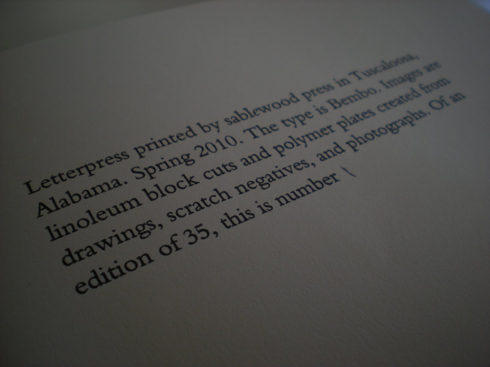
Spring semester I letterpress printed a 20 page, 5 folio, single signature chapbook containing images and text created and written by yours truly. This part fact, part fiction piece pushed me from the ends of devastation and euphoria and everywhere in between.I was faced with, what felt at the time, insurmountable obstacles.

Writing your own material to print is incredibly rewarding and highly frustrating. I am not the creative writer in this little duo, and I have always struggled allowing people read my writing. But I wanted to get this idea that has been rattling around in my head. Boy was going back to where it all began, he and I. And it got me thinking about this cool idea for a chapbook. Only trouble with that is the words you write need to be worthy of being printed on the page. Pressure to write something good...

The extent of my previous art training was an AP Art History class I took in high school (that's right, I got a 5, people). I have no formal training in design, drawing, or even the most basic functions of photoshop. The most consistent thought in my brain during that semester: "Why the hell did I think I could get a master's in ART when I can't even draw?" The artwork to accompany the text was the biggest struggle I encountered. I spent tens of hours pouring over certain images I was determined to make work. Finally, with the support of my professor, I had to abandon all the work I had done and start from scratch. I was faced with not relying on other sources but having to create the images all on my own. Again, I was faced with creating something worth creating.

After hours of toil, tears, and a few break throughs I have my first printed chapbook, The City.


Wednesday, April 21, 2010

Printing Project: French Fold

First Semester of my printing class was mostly just to get us used to the processes. We had five different projects ranging in different styles of printing and as of yet I still don't have any pictures of all of them. This semester was meant to get us into larger projects and teach us how to plan several elements at once.

The relationship between text and image, letter and letter, baseline and baseline is a delicate, complicated balance between white space and legibility, readability and optical alignment. I've read all kinds of essays, papers, and chapters from old typographic style manuals explaining how all the different styles of type faces interact or fight against the reader. In any project where you have a body of text, more energy goes into the planning than into the printing. You spend hours pouring over the text not only looking for typos but line spacing, letter spacing, how many words are in a line, how many lines are in the paragraph, where the text lies on the page, how does the text interact with white space, does the text belong on the recto or the verso, how close should the text lie to the fore edge, how close to the gutter? Hours and hours of planning...

French Fold Assignment: Our first project this semester is called a french fold wherein everything is printed on one side of a sheet of paper then the paper is folded twice. I chose to make a traditional french fold, like the birthday cards my brothers and I printed out from the family computer back in the good old days of dot matrix printers and Prodigy. Anyone remember that? Anyway, in terms the kids from day care would understand, you take a piece of paper and fold it hamburger style, then fold it again hot dog style and you've got yourself a traditional french fold.

For the text I had boy write a short short (a short story aboout 200 words or less) and I created the images.
The images are the nutmeg tree and the nutmeg seed. I found the images online, traced them and transferred them onto a linoleum block. The linoleum block is then carved around the image, leaving a relief block to be printed. First I printed the lightest color, in this case white. Then I carved away all that I wanted to stay white and printed the next darker color. For the cover the next color was light green. Then I carved away all that I wanted to stay light green and printed the last color, dark green. This exact print cannot be printed again, because by the end you only have the darkest color of the block left to print from. This process is called a suicide block. This process is incredibly time consuming with all the carving and multiple press runs, but incredibly fun and exciting. I personally love the raw, jagged lines. Its almost like a wood cut, but not quite :)
The inside image is made in the same process. You can only barely see the white in this photo (an argument for artists books in person, not online). I printed the red next, then the brown.
In the long process of planning the text, I had the crazy idea I would have this display letter at the beginning of the text. So I had to figure out just how much room to make for this O, what size font to use and just how to place it so it looks optically aligned. I printed the text first. I struggled soo much getting that damn little O in just the right place. But finally I got it right!